Conceptual Project
Community Music Center
Scroll ↓
Project Brief
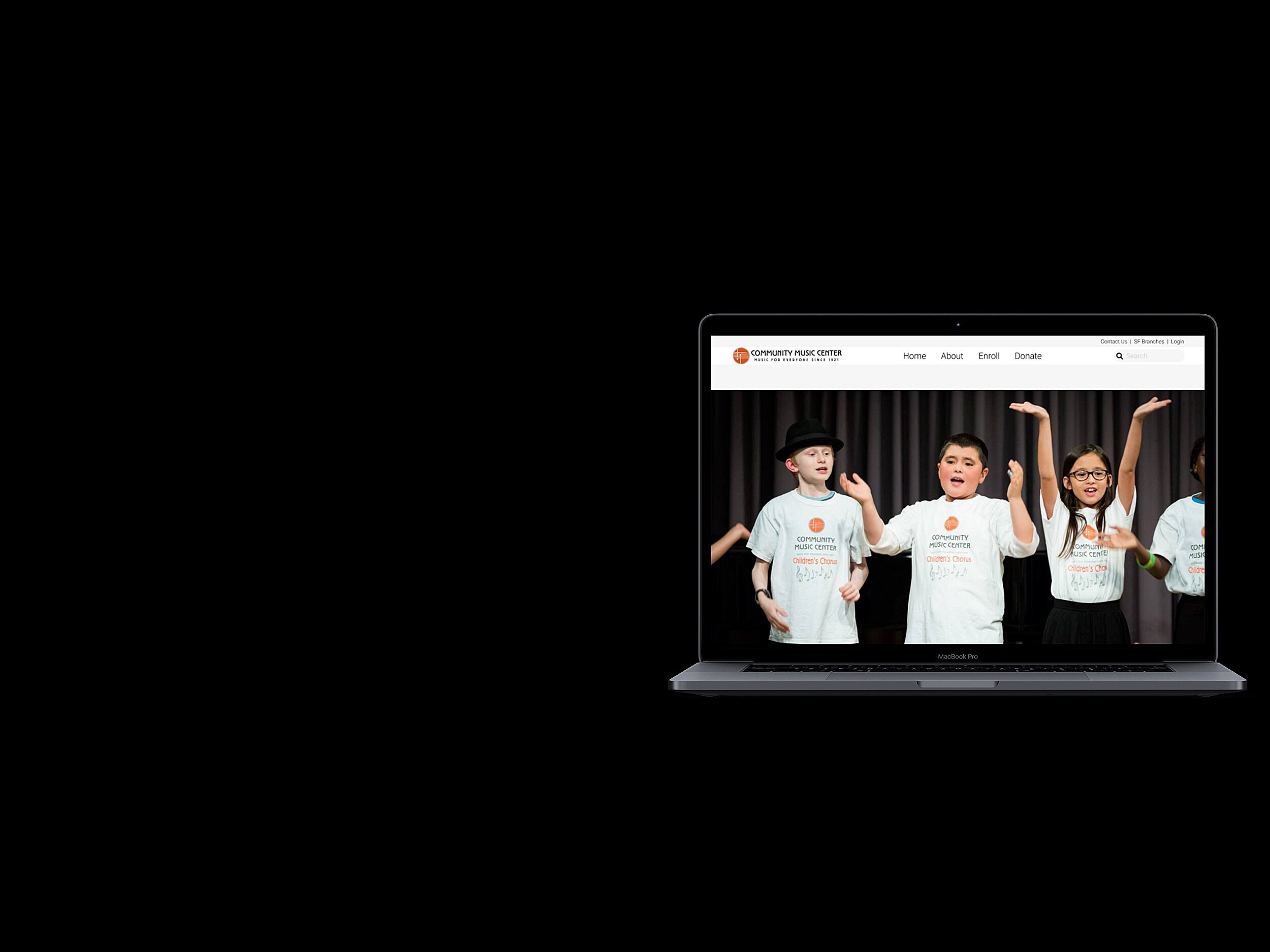
This was a conceptual group project for Community Music Center in San Francisco. Our goal was to increase donations and online class enrollment. We completed the project using a 3 step discovery, define, design process, and lastly pitched our idea’s on the next steps to take that would benefit the user. During our “discover” stage we started by analyzing CMC’s website to try and get a better understanding of who they are and the problems our users are having with their website. We then created a 4 pronged approach that mainly included interviewing/surveys, comparative analysis, competitive analysis, and usability testing. During the research process, we also did heuristics, site mapping, card sorting, user flows, sketches, business analysis, and user scenarios. We then moved onto the design process. During this process, we ensured that the user and their needs were the focal points. We started by sketching, we then decided on changing some of the colors and shades used on the old website while ensuring that we keep the warm and welcoming feel your current website offers. Once we had a visual representation of our new chosen colors we made a low fidelity wireframe of our first few pages. This gave us a deeper understanding of how the colors and layout of the pages would intertwine. We then increased the fidelity by adding images, buttons while simplifying the content to be easily navigated by our target user. Afterward, we moved onto prototyping the website and adding final iterations. We wanted to make sure the prototype was simple to navigate and offered a pleasant experience so we conducted usability testing. With the insights from our tested users, we decided on changes and iterations that would improve the overall experience.
Who is Community Music Center?

Community Music Center makes high-quality music accessible to people of all ages, backgrounds, and abilities, regardless of financial means. Classes are offered on a sliding scale and some are completely tuition-free.
Founded in 1921, Community Music Center is one of the oldest and largest community arts organizations on the West Coast. From our teachers to our staff, we’re all committed to sharing our love of music and helping our students succeed. CMC has branches in the Mission and Richmond districts, as well as programs throughout the city.
The Community Music Center’s website provides a wealth of information regarding the organization -- program offerings, enrollment, events, facility rental, news articles, etc.
Research
Scroll ↓
Heuristics

During our Heuristics process we discovered that the current website has issues with its Consistency and Standards, Aesthetic and Minimalist Design, Visibility and System Status, User Control and Freedom, Recognition Rather than Recall, and Page Errors. The above are just a few of the many problems we found on CMC’s website.
Business Analysis
Many non-profits have been hit hard by the pandemic, particularly those who rely on philanthropic donations to stay open
COVID-19 smashed traditional fundraising models for many non-profit organizations.
Non-profits adjusting to the new normal posed by COVID-19 with limited support (ex: tech assistance for non-profits adapting to working online by San Francisco Foundation)
Non-profits still striving to step in where governments & businesses failed (ex: SFJAZZ providing financial assistance to musicians & artists)
Music education in schools stay limited (banning indoor singalongs)
Pre Re-design Site Map

Post Re-design Site map

Card Sorting

Eight users were surveyed via OptimalSort using the Best Merge Method to narrow down the median results to use as the base for creating categories for the updated site map.
User Flow’s

Two user flows, current and updated, were outlined with the purpose of establishing what a user’s “happy path” or common flow would be for the following tasks: Enrollment & Donation.
Discover.
Scroll ↓
What we noticed.
During our analysis of CMC’s website we noticed that people are liking the selection of classes and the flexible payment options, so why aren’t they committing? We also know people feel very passionate about music education, so why are our supporters not donating? These are two very big questions.
To answer them & find solutions, we started with a 4-pronged approach, where we broke our research down into 4 parts with the objective being to narrow down first, who was using our site. Second, who is registering for our classes, third, who is supporting us through donations and how can we work together to improve their experience.
4 Pronged Approach

Interviewing/Surveys
We started off by talking to people. We created a survey where we aimed to gather people’s general thoughts & motivations around using an online platform for taking classes and making donations. This information was then used to create a list of interview questions so that we could gather more specific information about who was visiting our website.

Comparative analysis
Next, we took a look at other similar non-profit organizations. Our objective in doing this was to compare similar community-focused non-profits that have also had to shift from in-person courses to online. We looked at: What were their successes? What could they have done better? We also looked at how, or if, they are promoting & collecting donation funding, how the activities surrounding fundraising changed, and how this was implemented on their website.

Competitive Analysis
Then, we took a look at other non-profits focusing on music education, and compared our website layout & flow with theirs. We paid particular attention to their enrollment and donation process to see if there were any efficiencies that we could carry over to our website.

Usability Testing
In the final stage of our research, we dissected the core skeleton of the website, by deconstructing it and soliciting feedback from users on the website’’s navigation, we then reorganized it to reflect the users’ insights for groupings of information.
Define
Scroll ↓
Survey Results

We started by conducting a survey that aimed to find out what people’s past experiences were like in terms of making donations and signing up for classes online. This survey was designed with the intent to focus on their frustrations, disappointments as well as happy points. We received 33 responses out of the 35 ppl who filled out the surveys. But what we found really interesting is that the pain points were very similar across the two different tasks and this pattern was not just from the multiple-choice options that we provided but was also prominent in the elaborated answers they submitted. So people generally appreciate having fewer steps; which is not surprising. But there are those ppl who feel nervous about the whole process is too simple, in that case, people wanted a prompt follow-up as a complementary way to really ensure that they’ve performed and completed a successful task on the website. People also generally want to give out as little information as possible.
Interview Results
We then wanted to dive deeper and really look into people's expectations. So, we recruited three people that we believe to have a common interest in non-profit music organizations. And by interviewing them, we were able to obtain critical insights, that were not available in the surveys.
First, ppl wanted transparency especially when they are making donations. For instance, they wanted to know how much the organization has already raised. They also wanted a follow-up with some kind of acknowledgment or appreciation. In regards to enrollment, ppl wanted to have the option to sign up for a trial before making any real commitment.
Interviewee “B”
Wants to make a difference
Wants transparent donation & payment process
Interviewee “C”
Passionate about organizations they donate to
Prefers convenience of online
Interviewee “L”
Transparent donation process & follow-up desired
Trial for online courses desired
Analysis Of The Music Industry

As we are all aware, COVID has really crushed the traditional fundraising model and non-profit organizations like CMC are trying to survive with surprisingly little tech assistance. So why does it matter for CMC to continue what they are doing when the environment is so tough? In other words, why do we need to make their online platform stronger? Well, according to experts, music remains crucial especially for children during the pandemic crisis because it helps them foster their emotional & social skills as highlighted in Althea’s quote earlier. However, given where things are in the world today, music education in schools is very limited. For instance, they are not allowed to do sing-alongs inside. So for nonprofits like CMC, we really need to step in and fill that gap where governments and schools are falling short.
Competitive Analysis Results

Now let’s look at how CMC’s fellow institutions are doing at a time like this? Our group has selected these five organizations as competitors and this selection was based on three criteria - their location, mission, and the service they are offering. So these five are all located in or proximate to San Francisco and they are currently offering music classes online. As researchers and UX designers, we tested their websites to see what the user journey is like in regards to our main tasks - donation and enrollment. This task analysis showed that on average, it takes about 5 steps for a person to complete the task. So what about CMC’s website? As of now, users need to go through at least 8 steps in order to get to their destination point. We need to fix this.
Affinity Diagram/Mapping
After the interviews were completed, We collected all the insights and started grouping them on whimsical as a team to see if there are any recurring patterns and themes.

User Persona
With all the data we collected from affinity mapping we started to mold a user persona (Profile of our target user).
To meet the generous music enthusiast.
They are the ppl who believe in the power of music education and also believe in supporting the local community at a time like this matters. They also want to make sure that the process is transparent. And as music enthusiasts, they want to enroll their children in our online classes, and they want this process to be as simple as possible. In order to make those decisions, they know that they’d need to browse through a lot of information of different classes and fill out a bunch of forms, So they strongly prefer using a desktop or a laptop when performing those tasks which led us to decide that we are redesign CMC’s website page for a desktop rather than a mobile app.
Needs:
A fast & simple checkout process
Transparent donation process
Clear & concise instructions
Pains/Frustrations:
Too many forms during checkout
Requiring newsletter signup
No updates on donation impact
Design
Scroll ↓
Design Strategy
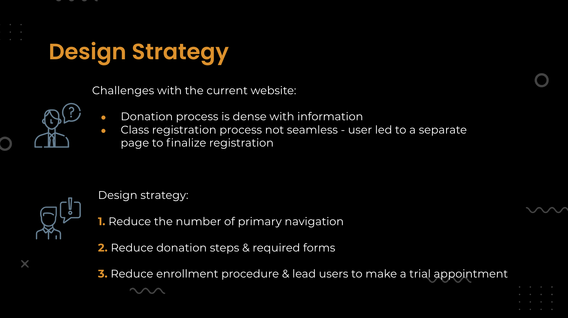
Throughout the design process, we made every decision based on our research and the target user.
We started by sketching our ideas onto paper in order to give ourselves a visual understanding of the end goal.
We then decided on changing some of the colors and shades used on the old website while ensuring that we keep the warm and welcoming feel your current website offers.
Once we had a visual representation of our new chosen colors we made a low fidelity wireframe of our first few pages. This gave us a deeper understanding of how the colors and layout of the pages would intertwine.
We then increased the fidelity by adding images, buttons while simplifying the content to be easily navigated by our target user.
Afterward, we moved onto prototyping the website and adding final iterations.
We wanted to make sure the prototype was simple to navigate and offered a pleasant experience so we conducted usability testing.
With the insights from our tested users, we decided on changes that would improve the overall experience.
Inspiration

Primary Navigation Inspiration
The navigation in the center draws attention, highlighting the main tasks offered by the website
Simple, intuitive, meet’s user’s expectation (logo - right, menu - center, search bar - right)

Primary Body Inspiration
The body of Coyote provides a good sense of grouping and clears the website up improving the navigational process.
It is simple, grouped, and provides hierarchy.
Color Pallets

Original Website Colors
Here is a visual representation of the current website’s color palette. Although some of the colors provide the feel we are looking for we felt that the website missed some white space which would give the website more of a breathable feel.

Updated Website Colors
As you can see we made the colors lighter and added some white to make the website less cluttered while still keeping some of the warm and inviting colors previously used.
Low Fidelity Sketches


Sketches were drawn out at the start of our conceptualizing with the purpose of creating a visual starting point to create wireframes from.
How can we help CMC in the future? Based on the feedback from our prototype’s first draft, usability testing, and research we would recommend
Simplifying the user's experience with the enrollment page.
Changing aspects of the donations page to make the process less confusing.
And adding a profile section to allow the user to input preferences.